Project page
QuickCart
A grocery delivery app that keeps the delivery promise visible, keeps add-to-cart one tap away and names every fee before payment.
Challenge
Quick-commerce apps have proven that people want groceries in minutes. Many of them then bury that promise under promotions, dense layouts and fees that only appear at checkout.
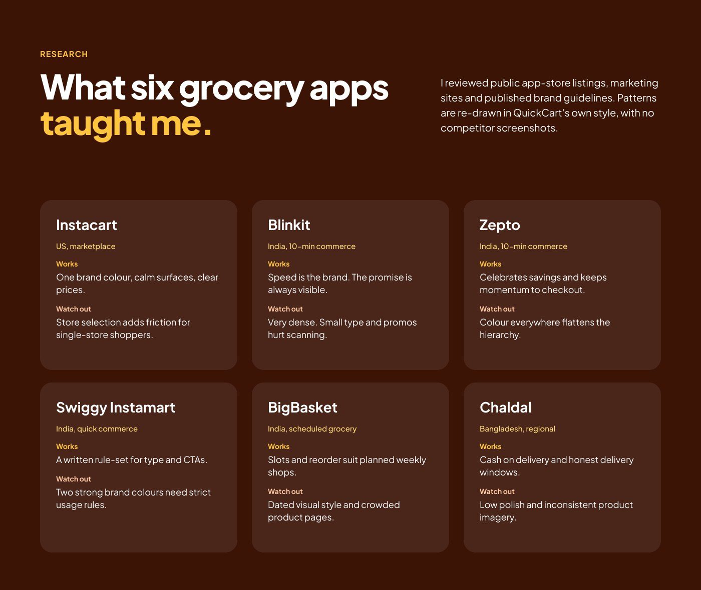
I reviewed six grocery apps (Instacart, Blinkit, Zepto, Swiggy Instamart, BigBasket and Chaldal) through their app-store listings, websites and published brand guidelines. What I learned:
- One calm brand colour and clear prices build trust.
- Very dense screens and constant promos make scanning hard.
- Fees that appear late break trust at the last step.
- Cash on delivery and honest delivery windows matter, especially in Bangladesh.
Solution
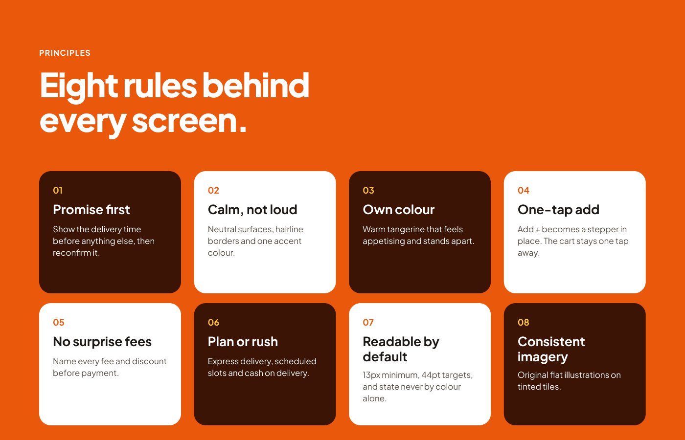
QuickCart follows eight design rules, from Promise first to No surprise fees.
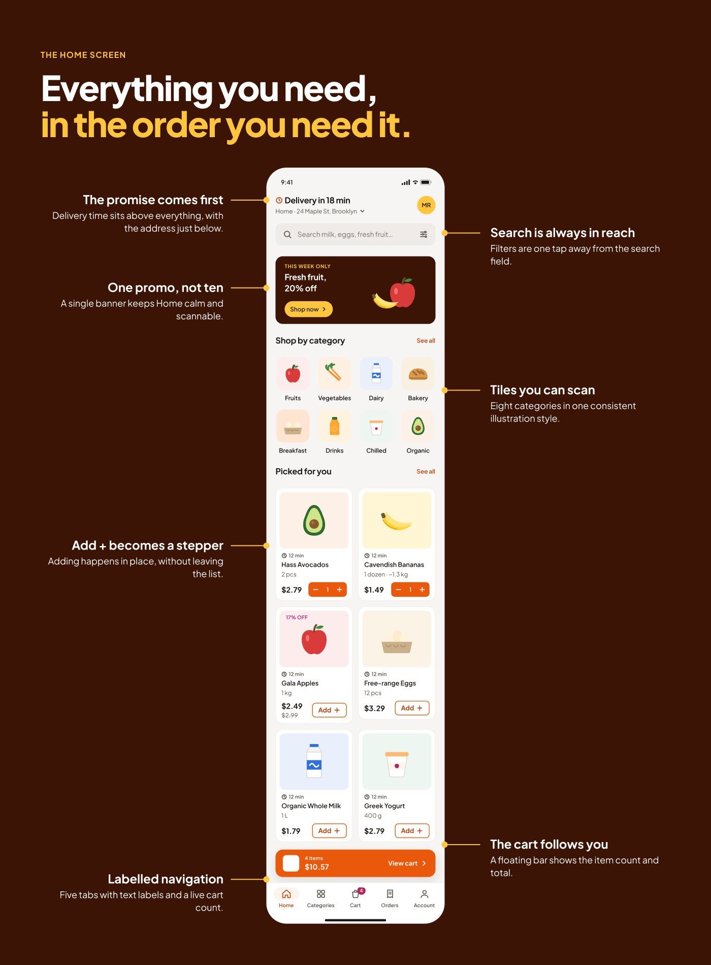
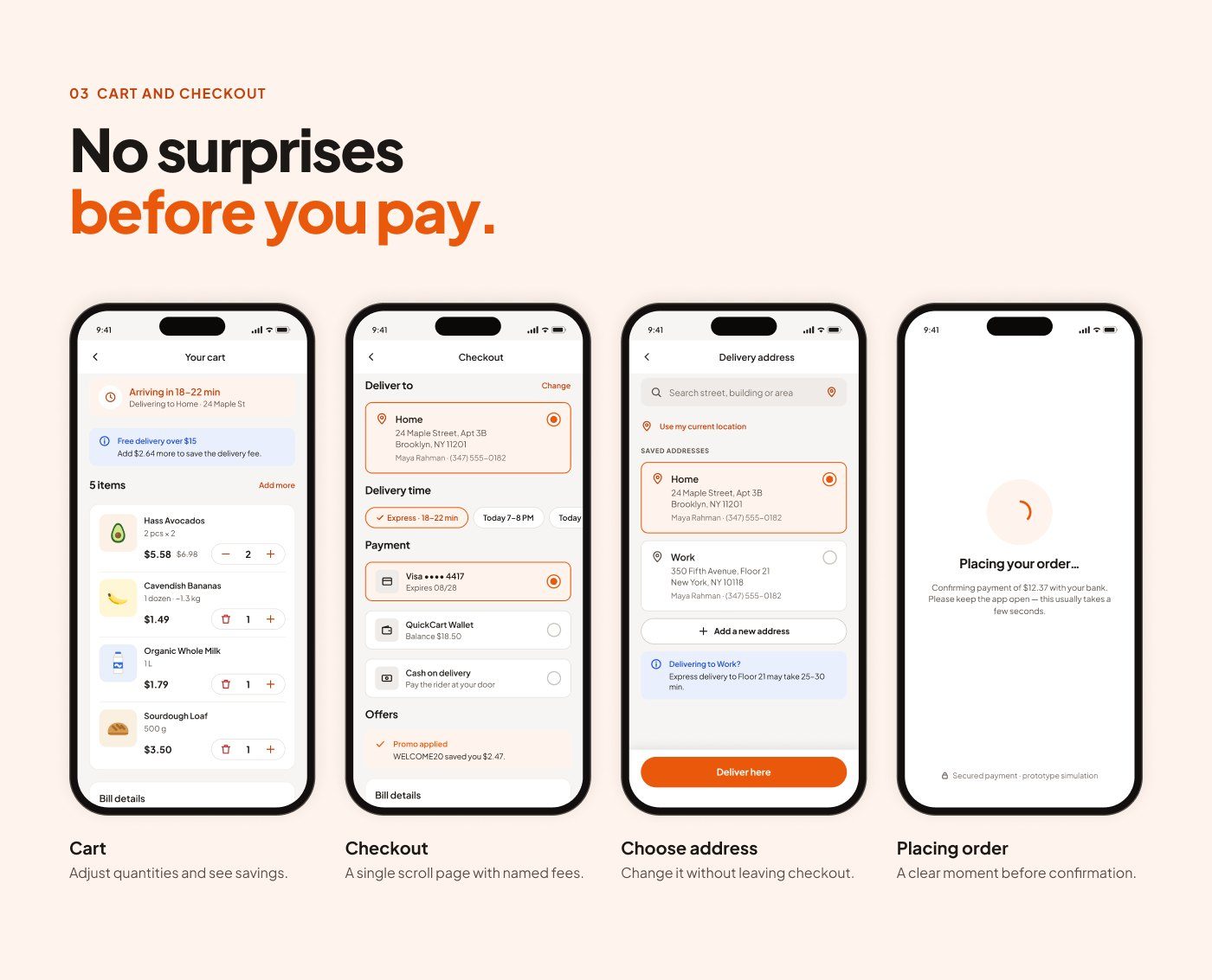
- Promise first: the delivery time sits above everything on Home, and is confirmed again in the cart and at checkout.
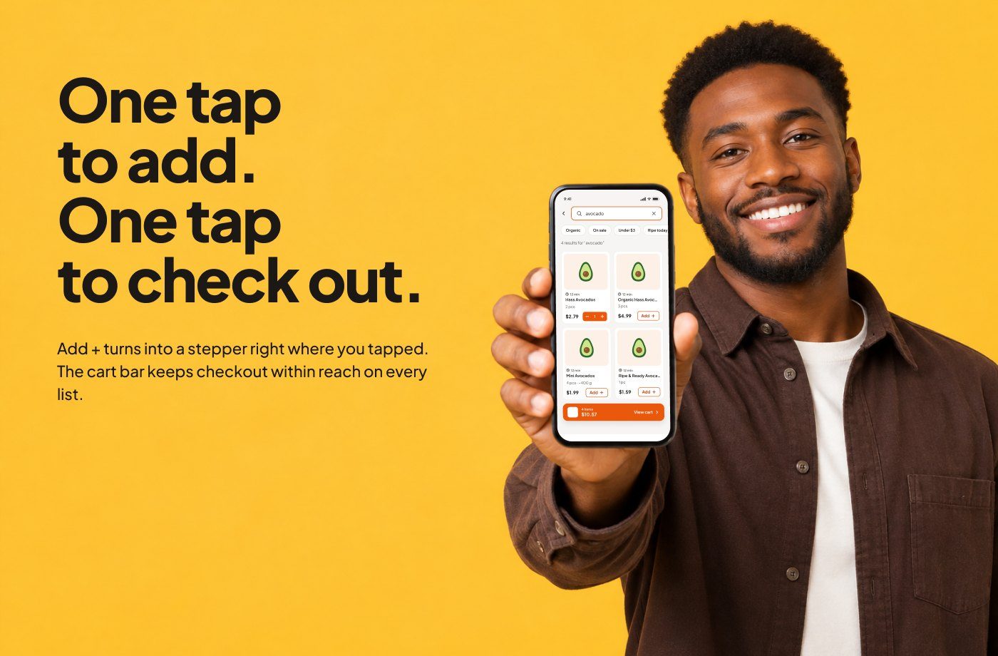
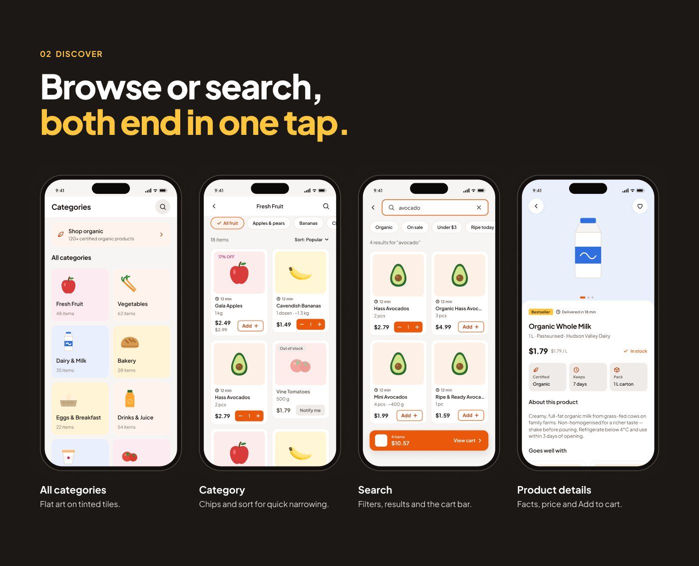
- One-tap add: Add + turns into a stepper right where you tap, and a floating cart bar keeps checkout one tap away.
- No surprise fees: a single-scroll checkout names every fee, slot and discount before payment, with cash on delivery as an option.
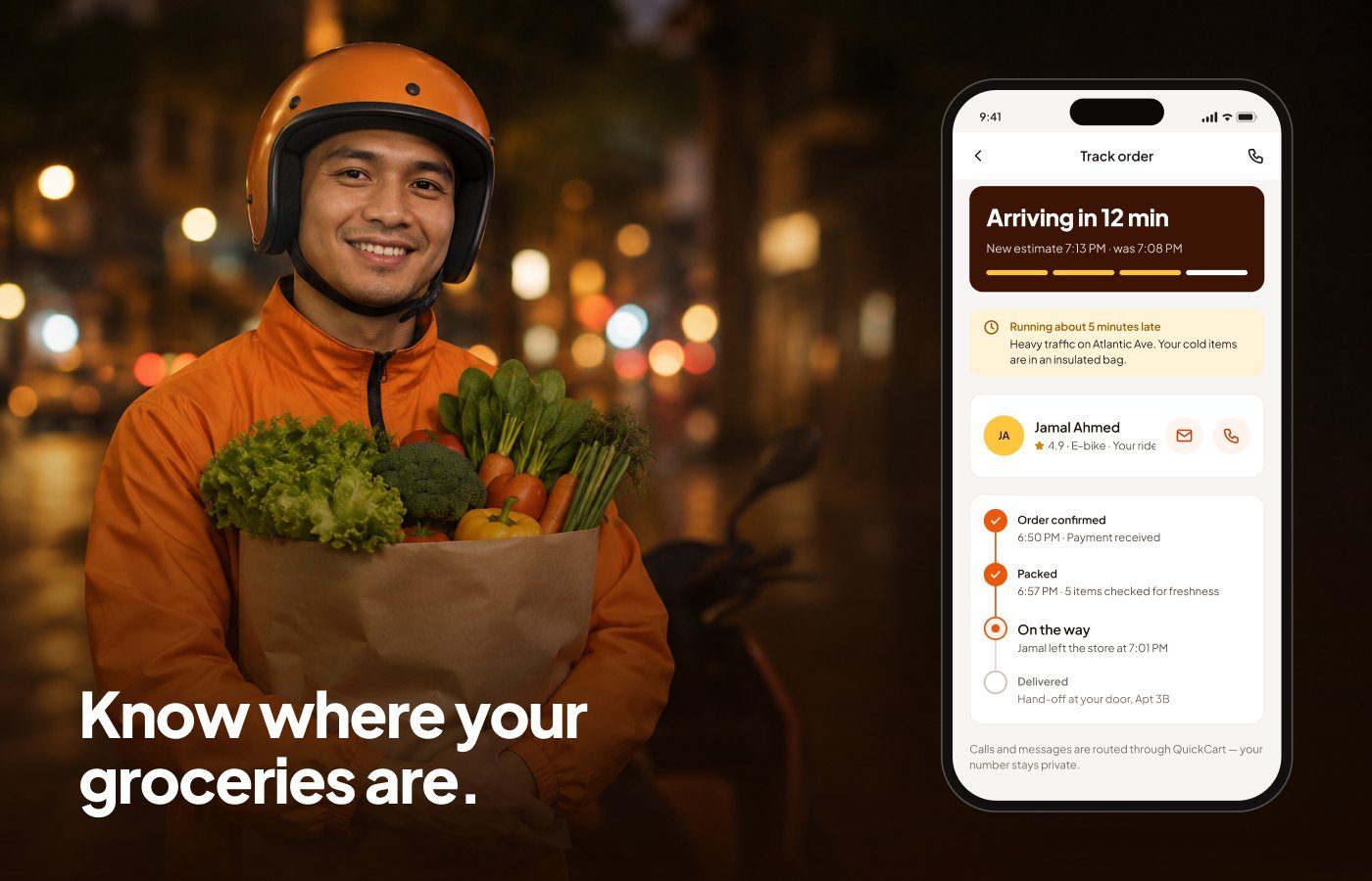
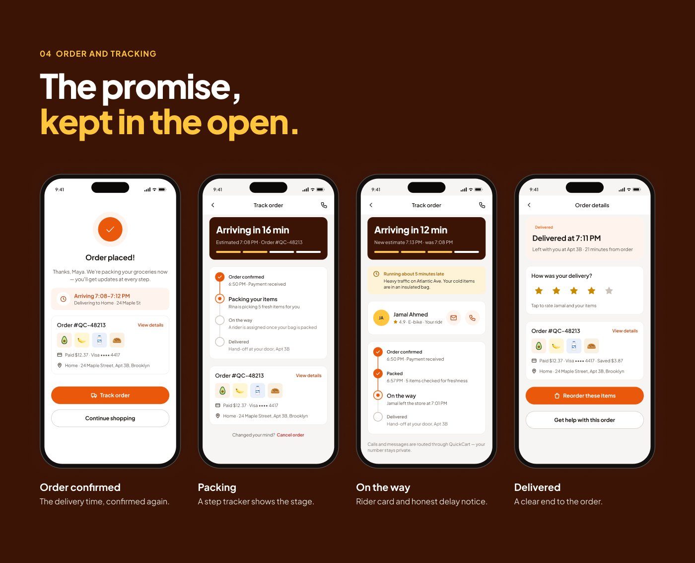
- Honest tracking: a step tracker with a rider card and clear delay notices.
- Readable by default: 13 px minimum text, 44 pt touch targets, and status never shown by colour alone.
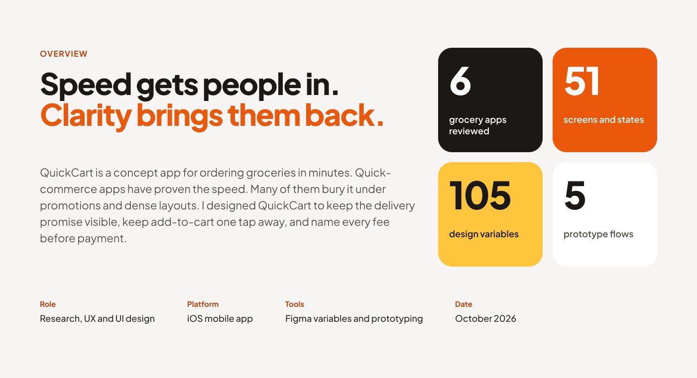
The result is 51 screens and states built on 105 Figma variables, with 5 prototype flows that also cover login errors, empty carts and failed payments.